Cover Love Sunday is a weekly feature hosted at The Quiet Girl Talks, where you choose your 3 favorite covers for each weekly theme. Anybody can do it, just check the Features page for themes ahead of time! :)
This week's theme is...
SIMPLE COVERS!
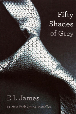
Simple Covers I love a good simple cover they can speak so much louder sometimes than a more elaborate cover don't you think? A piece of silk, a flower, butterfly, a dagger, or even just a letter even without a lot else going on the background. A simple silk gray tie, hint, hint, I know you know what book I'm talking about with that one.


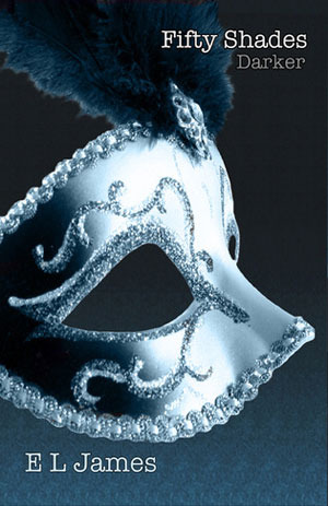
Yes Fifty Shades...hey their simple covers aren't they, lol. Elaborate reads but simple covers I love that each one has something that you'll see in the book. Christian's oh-so-famous tie, the mask Ana wears to the party, and handcuffs which can actually represent two different happenings in the book one a every sexual scene the other when someone goes to jail. I don't suggest reading them if your single or don't have a 'special' friend though you wont like that frustration, lol.
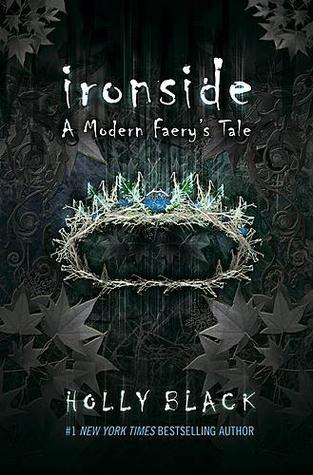
I've read Tithe it was the cover that always attracted me to it whenever I was it however it was hard to get into. I haven't read Valiant or Ironside but do want to I like all the covers but this in is my favorite their all simple this one two though there is a bit of detail in the background but I think it can still pas for simple I love that crown just love it the colors are so vibrant. I read synopsis of this one and Roiben is getting coronated in the faerie realm so its only fitting the theres a crown on the cover.
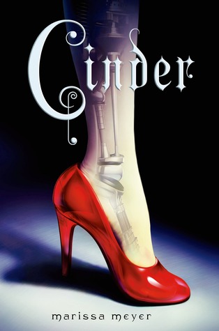
I've heard some good things about this book apparently its a future telling retelling of Cinderella I like that theres like a spot light on the leg and black everywhere else and that you can see in the leg. I also like the font for the title. The other cover are nice to but thought this one more 'simple'
Well those are my picks this week what are the simple covers you would pick?

